We all have fond memories of using trains in our younger days, and comments such as “I can remember when you could get from Birmingham to London for £20” are commonly heard by the ticket booths in train stations, as people are continually shocked by the current price of tickets. In recent months, the media have spend a lot of effort reporting the rising cost of transport and the fact that they are increasing faster then inflation:
In the UK about half of all train fare are regulated by the UK government and are increased according to the formula of the inflation rate as measured by the Retail Price Index (RPI) in July, plus 1%. In July 2011 the RPI inflation rate was 5%. This leads to the questions:
- How have train fares compared to UK inflation over the long term?
- Have they increases on average, in-line with inflation or faster?
Additionally is the inflation rate as measured by RPI telling the whole story, and does this fairly reflect the affordability of train and bus fares?
The price data to analyse the relative increases for rail fares, comes from the underlining data for goods and services compiled by the Office of National Statistics (ONS) since 1987. This is the same data the ONS use to calculate the UK inflation rate as measured by the Consumer Price Index (CPI) and Retail Price Index (RPI). All the data used here has been index to January 1987 to allow simple comparison of price increases. For example an index value of 300 in 2011, means that that the price at this time had tripled since January 1987 (when it was 100). The charts of the sector breakdown of the ONS inflation data came from InflationaryPressure.com.
The chart below shows the index values of train tickets against RPI for the last 25 years. It can clearly be seen that rail fares have increased faster than inflation, as measured by RPI over the last quarter of a century. A closer examination of the chart reveals an increase in-line with RPI until 1991. After this, they increased at a slightly faster rate, but not by much. However since the early 2000s rail fares started to increase faster than RPI. By 2011 RPI had increased approximately 2.5 times since 1987, compared to train travel which increased by approximately 3.5 times!
So the answer to the first question posed earlier, - yes, train fares have increased faster than inflation over the majority of the last 25 years.
 |
| Chart of Historical UK Train Fares against UK Inflation RPI Since 1987 |
However does this tell the whole story? Does this mean that on average bus and rail fares are much more expensive than they were in 1980s? What about the affect of rising wages over the last 25 years? Did they rise in line with inflation?
Below is a chart showing the average salary index against RPI. It can clearly be seen that the average wages in the UK have increased faster than inflation, as measured by RPI, for almost 75% the the last quarter of a century. It is true that average salaries have been increasing at a much slower rate than RPI since the Credit Crunch which started in late 2008, however over the last 25 years, the compounded growth of average wages has out striped RPI. By 2011, RPI had increases approximately 2.5 times since 1987, however average wages had increased by over 3 times!
 |
| Graph of Historical UK RPI Inflation against Average Salary Growth |
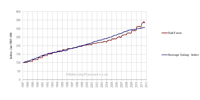
When train fares are compared to average salaries a different trend is discovered, as shown in the chart below. It now seems that train fares almost perfectly track average wages over the last 25 years. There was a slight deviation in the increases in the early 2000s, when train fares increased less than RPI, but this was a relatively small amount.
 |
| Chart of Historical Train Fares against UK Average Salary Growth Since 1987 |
 |
| Graph of Historical UK Train Fares against Bus and Coach Fares Since 1987 |
This leads to the conclusion that wages make up the largest part of the cost-base for trail, bus & coach fares as they have all increased faster than inflation, but in-line with average salaries for a quarter of a century. So to get train, bus or coach fares to be cheaper in the future, the companies need to 1) be more efficient or automated (ie reducing the head count) or 2) the wages of their staff need to decrease relative to the national average, or a combination of the two. Not a very pleasant prospect for the employees in the rail, bus and coach industries, if everyone says that fares are too expensive and must come down in the future.
So train, bus and coach fares are just as cheap (or expensive) relatively to wages as they were 25 years. This will be a controversial result to many.
Written by Inflation Monkey. Join on Google+.
No comments:
Post a Comment