Wednesday, 24 October 2012

Average Income for Pensioners Has Never Been Better! (Statically at Least)

Here is a very interesting chart from the Economic Research Council Weekly Digest Chart of the Week, which was on the Average Income for Pensioners.  A recant report from the ONS showed how pensioners' net income has changed over the past ten years and it is largely good news for pensioners as they received on average 27% increase in their real income. However things aren't all rosary, when you investigate the number in detail thee is still a large amount of inequalities still exist.  

Click here is see the Average Net Income Distribution of UK Pensioners.

Friday, 31 August 2012

Expect UK house prices to fall as banks pull back from the property market - MoneyWeek

The Prospects for the UK Housing Market Don't Look Promising!

The most important drivers of the UK property market is borrowers’ access to credit.  Until the resent credit crunch, almost everyone had forgotten about this and thought is was just aspirational and want that drove it.

So with this in mind how is the UK property market going to perform in the next few years.  statistics - Banks are pulling back from property - expect prices to fall. 

Friday, 24 August 2012

Macro Man: Life's Little Luxuries

The Italian Government Takes No Prisoners In Its War On Tax Evaders

If you are in any doubt about the scale of the super yacht exodus accros the Club Med Countries have a quick look at this report on empty marinas across Italy.

Meanwhile who’d want a new Ferrari after last year’s campaign against tax evaders – which involved tax inspectors raiding the owners of luxury cars in smart ski resorts and visiting Ferrari-owner events to check the tax returns of every single driver?  According to the blogging hedge fund manager at www.macro-man.blogspot.com the “persecution of Ferrari owners” has become so severe that they are selling them in their thousands. You can now pick one up for the “price of a new VW Polo”.

This is not only bad for Ferrari but all Luxury Car companies, not only are sales being hit by general austerity and shocking enforcement of the law, but global second hand prices are likely to be hit by the new exodus of cars from Italy.  “This is going to be “a vicious value collapse” says Macro Man.

Will this mean people will be turning against ostentatious wealth, and luxury brands associated with it?

Sunday, 27 May 2012

Copper Price is as Expensive as it was in the 1970s – Inflation Adjusted Historical Copper Price since 1900 in Pounds Sterling and US Dollars


Copper Price Today is as Expensive as it was in the 1970s Once Accounting for Inflation


Copper in a common metal which as been used since ancient times.  Due to its very good electrical and thermal conductivity it used in a very wide range of industrial applications from wires cables to sea water corrosion resistant bronzes used to make marine propellers.  Because of this it is often refereed to as one if the bellwether industrial commodities, which are used to trend the health of global industrial production. 

Over the last couple of years, I have repeatedly come across comments that copper has never been this expensive and that this will push  up the price of consumer goods or cause industrial production to slow or contract.  There are some reviews of the copper market and price such
as the following:

"What to do as Dr Copper turns bearish" 
"The Copper Yuan Carry Trade"
"Copper and Global Stock Markets Rollover"
"Copper Price Forecast, The Fall of The ChineseMiracle 2012" 

However these don’t usually cover the long term price history or adjusted to account for inflation, so I thought that I would investigate.

The annual average copper price data since 1900 to2010 came from the USGeological Survey.  The data for 2011 and the early part of 2012 came from the World Bank.  In both cases the price data is based on the average price of Grade A cooper traded on the London Metals Exchange (LME).  The historical UK Pound to US Dollar exchange rate data came from Lawrence H. Officer, "Dollar-Pound Exchange Rate From1791", MeasuringWorth, 2011 at www.measuringworth.com/exchangepound/The prices were adjusted for inflation by converting the nominal price into the equivalent in 2011 US Dollars and 2011 GP Pounds Stirling.  The US inflation data came from the historical CPI from the US Department of Labor

For the UK inflation the data came from Dominic Webb (2006) "Inflation:the Value of the Pound 1750-2005" Economic Policy and Statistics Section, Research Paper 06/09, House of Commons Library, UKFrom this you get the following results shown in the graph below.
Chart showing the historic price of copper and the inflation adjusted copper price since 1900 to 2011 in Pounds Sterling and Dollars
Historical Annual Average and Inflation Adjusted
Copper Price since 1900 in US Dollars and UK Pounds


The doted lines are the unadjusted nominal annual average copper price, and the sold lines are the inflation adjusted copper price.  The first thing that becomes obvious is that the unadjusted copper price was at its lowest in the in 1932 in both US Dollars and Pounds Sterling at approximately $128 and £36 per a metric tonne respectively.  Additionally before 2012 the nominal price peak occurred in 2011 in both US Dollars and UK Pounds at $8,823 and £51504 per a metric tonne respectively. 

However when you examine the inflation adjusted copper price, you notice that its lowest prices occurred in 2002 in US Dollars at $2,089 and in 1999 in UK Pounds at $1,465 per metric tonne.  The closed the inflation adjusted price came to those lows in both currencies, occurred in 1932, 1945, and 1993.  The highest inflation adjusted price happened in 1916 in US Dollars and Pounds Sterling at $12,962 and £9,383 respectively. 

The historic inflation adjusted copper prices in US Dollars and UK Pounds can be more easily seen in the chart below which only shows the inflation adjusted price on a linear axis (non logarithmic, unlike the first chart).
Graph showing the Inflation Adjusted Copper Price since 1900 in US Dollars and Pounds Sterling
Inflation Adjusted Copper Price since 1900 in US
Dollars and Pounds Sterling


As it came bee seen the general trend in the inflation adjusted copper prices was a high volatility before the 1920s, were upon it experienced a sharp decrees by the early 1920s.  Prices were relatively stable from the 1920s until the end of the 1940s, in competition to the price volatility see before the 1920s.  During the 1950s there was a sharp rise to $7,662 and £6,775 in US Dollars and GB Pounds respective.  The price dropped almost 50% by 1958 in both currencies, where upon it steadily increased to peak in 1970 and 1974 at a price similar to that in 1955.

From the peak in 1974 the price steadily decreased to an all time inflation adjusted low by 2002 in US Dollars at $2,089 per metric tonne.  In UK Pounds the all time inflation adjusted low occurred in 1999 at $1,465 per metric tonne and this was almost matched again in 2003 at £1,483.  Since these lows the inflation adjusted copper price was increases rapidly to prices comparable to those seen in the 1970s.

Using the price in 1900 as a baseline the inflation adjusted copper price in UK Pounds and US Dollars was indexed.  This allows the examination of the relative price changes during this historical period of time more easily and is shown below.
Graph showing inflation adjusted copper price index to the price at 1900 equalling 100. m The graph clearly shows that the when inflation is accounted for the copper price in 2011 is simular to that in the mid 1950's and late 1960's.
Historical Inflation Adjusted Copper Price since
1900 in US Dollars and GB Pounds, Indexed to 1900


The indexed price data clearly displays that the historic inflation adjusted copper price has drop since the 1900s but not by any ware as much as the inflation adjusted aluminium price had done.  By the early 2000s the copper price bottomed at almost 20% of the price of what it was in 1900.  This was slightly lower than the previous bottom in 1930.  The current copper price by the beginning of 2012 is comparable to the inflation adjusted prices in the 1970s, which were slightly lower than the average in the years before the 1920s.

So from a historical perspective once inflation has been accounted for the price of copper is comparable to the peaks seen in the 1970s.  This begs the question, as copper is used as a bellwether the health of global industrial production, does this means the developed economies are due to repeat the economic difficulties that were experienced in the 1970s?

Written by . Join on Google+

Monday, 7 May 2012

Aluminium the Metal that has Never been so Inexpensive – Inflation Adjusted Historical Aluminium Price since 1900 in Pounds Sterling and US Dollars

 The Metal that has Never been Cheep - Aluminium

Aluminum is a silvery white metal used in a wide verity of industrial application and in consumer products.  It is the third most abundant element and the most abundant metal, in the Earth's crust.  Aluminum is a remarkable metal due to its low density and for its ability to resist corrosion via passivation.  Many of the structural components made from aluminium and its alloys are vital to the aerospace industry and are important in other areas of transportation and structural materials.

Aluminum forms strong chemical bonds with oxygen.  Compared to most other metals, it is difficult to extract from ore, such as bauxite, due to the high reactivity of aluminum and the high melting point of most of its ores.  For example, direct reduction with carbon, as is used to produce iron, is not chemically possible because aluminum is a stronger reducing agent than carbon.  Aluminium electrolysis with the Hall-Héroult process consumes a lot of energy.  Electric power represents about 20% to 40% of the cost of producing aluminum, depending on the location of the smelter.

There are some reviews of the aluminium market and price, but these don’t usually cover the long term price history or adjusted to account for inflation, so I thought that I would investigate.

The annual average aluminium price data came from the US Geological Survey and it dates back to 1900.  The historical UK Pound to US Dollar exchange rate data came from Lawrence H. Officer, "Dollar-PoundExchange Rate From 1791," MeasuringWorth, 2011 at www.measuringworth.com/exchangepound/.  The prices were adjusted for inflation by converting the nominal price into the equivalent in 2011 US Dollars and 2011 GP Pounds Stirling.  The US inflation data came from the historical CPI from the US Department of Labor.  For the UK inflation the data came from Dominic Webb (2006) "Inflation: the Value of thePound 1750-2005" Economic Policy and Statistics Section, Research Paper 06/09, House of Commons Library, UK.  From this you get the following results shown in the graph below.

Chart showing the historic price of aluminium and the inflation adjusted aluminium price since 1900 to 2011 in Pounds Sterling and Dollars
Historical Annual Average and Inflation Adjusted Aluminum Price since 1900 in Pounds Sterling and US Dollars


The doted lines are the unadjusted nominal annual average aluminium price, and the sold lines are the inflation adjusted aluminium price.  The first thing that becomes obvious is that the unadjusted aluminum price was at its lowest in the late 1940s in both US Dollars and Pounds Sterling at approximately $331 and £82 per a metric tonne respectively.  Furthermore before 2010 the nominal price peak occurred in 2006 in both US Dollars and UK Pounds at $2,690 and £1,453 per a metric tonne respectively. 

However when you examine the inflation adjusted aluminium price, you notice that its lowest prices occurred in 2002 in US Dollars at $1,792 and in 2003 in UK Pounds at $1,190 per metric tonne.  These lowers were virtually matched in both currencies happened in 1992, 1999, and 2007.  The pries see in 2010, in both US Dollars and Pounds Sterling are comparably to the inflation adjusted prices through out the 1990s and 2000s.

The historic inflation adjusted aluminium prices in US Dollars and UK Pounds can be more easily seen in the chart below, which only shows the inflation adjusted price on a linear axis (non logarithmic, unlike the first chart).

Graph showing the inflation adjusted aluminium price is cheaper than most of the 19 century
Historic Inflation Adjusted Aluminum Price since 1900 in US Dollars and Pounds Sterling


The inflation adjusted price of aluminium was flat for the first 5 years of 20th Century whereupon it rose rapidly and peaked in 1907 at $24,000 and £20,150 per metric tonne.  From this peek it fell steady for the next 10 year, until 1941 were it experienced a sharp rapid increase, which coincided with the First World War (WWI) and fell back to its pre war prices by the 1920s.  The price remained fairly flat thought out the 1920s and 1930s.  There was a substantial decrease in the prices in the early 1940s, however from the late 1940s until the late 1970s the aluminium prises stayed pretty constant between $4,500 to $3,500 and £4,000 to £2,300 per metric tonne.

Using the price in 1900 as a baseline, the inflation adjusted aluminium price in UK Pounds and US Dollars was indexed.  This allows the examination of the relative price changes during this historical period of time more easily and is shown below.

Graph showing inflation adjusted aluminium price index to the price at 1900 equalling 100. m The graph clearly shows that the when inflation is accounted for the aluminium price in 2011 is a lot cheaper than it was in the 1950's, 1960's, 1970's and 1980's.
Historical Inflation Adjusted Aluminium Price since 1900 in US Dollars and GB Pounds, Indexed to 1900

The indexed price data clearly displays that the historic inflation adjusted aluminum price has fallen considerably since the 1900s.  Once inflation was accounted for the real price of aluminum by 2000s was approximately a tenth of what they were at the beginning of the 20th Century.  So from a historical perspective once inflation has been accounted for,  the price of aluminium has virtually never been cheaper.


Sunday, 25 March 2012

In Which Currency is Crude Oil Presently Cheapest?

The Crude Oil Price Peeked in 2008 but how Expensive is it now in World Currencies

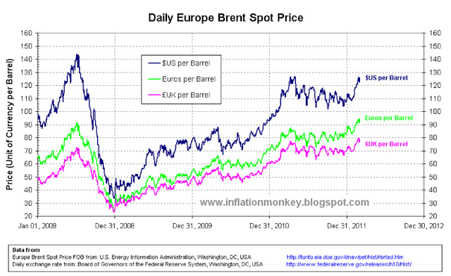
Just recently there has been a lot of talk about the price, plus the increasing price of petrol and diesel (which our US brethren refer to as "gas").  So I thought that I’ll look at the crude oil price over the last couple of years.  There are many benchmarks for the crude oil price, such as the West Texas Intermediate (WTI) and Dubai Crude, but I’m going to use the Brent Crude spot price.  The nominal Brent Crude oil price peaked on 3rd July 2008 at $143.95 (US Dollars) per barrel, before rapidly falling during the “credit crunch“ after the collapse of the US Investment bank Lehman Brothers Holdings IncThe nominal Brent Crude price bottomed on 26th December 2008 at $33.73 per barrel.  Since that time the prices have increased and by the 1st March 2012 the price was $125.76 per barrel, which is 87% of the peak price on 3rd July 2008.  However unless you live in the US, buy all your goods and get paid in US Dollars, the Dollar price of crude oil doesn’t mean much as your reference will be another currency.  So I’ve converted the crude oil price since 2008 to determine the price in several world currencies.  The Brent Crude Oil price since 2008 in US Dollars, UK Pounds and Euros is shown in the chart below.

Graph showing the daily price of brent crude oil since 2008 in US Dollars, Euro and Pounds Sterling
Daily Brent Crude Oil Price since 2008 in US Dollars, Pounds Sterling and Euros per Barrel.


The data for the historic daily Brent Crude Oil spot price since 2008 came from the US Energy Information Administration, the and the daily international exchange rates forUS Dollars came from the Board of Governors of the Federal Reserve System, Washington, DC. 

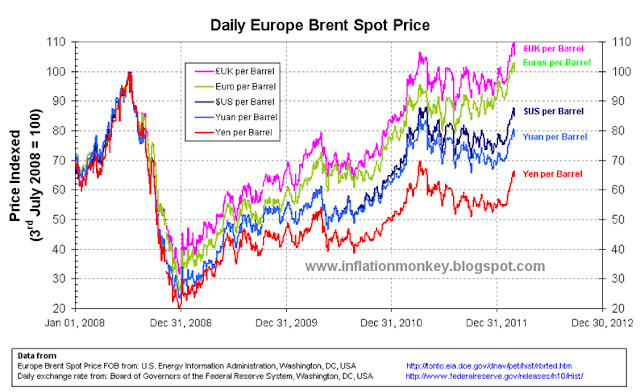
From the chart above you can see that the oil price in UK Pounds and Euros (EUR) at the time of the peak on 3rd July 2008 were £72.61 and EUR 91.64 per barrel respectively.  Furthermore their receptive price on 1st March 2012 was £78.83 and EUR 94.41.  As it can be seen these vales are higher than those see at the peak price on 3rd July 2008.  Normalizing the crude oil priced in the different world currencies by indexing the prices to the value on 3rd July 2008 (i.e. by making the value on that date = 100) highlights the comparative price changes between those currencies over time.  The chart below shoes the index daily Brent Crude Oil price since 2008 in US Dollars, GB Pounds, Euros, Japanese Yen and Chinese Yuan.  Its interesting to note that compared to the 2008 peak price, the oil price at the beginning of March 2012 in Chinese Yuan and Japanese Yen is approximately 78% and 65% respectively.  Compare this to approximately 85% for the price in US Dollars, quite a difference!

Graph showing the daily price of brent crude oil indexed to the peak price in 2008 which occured on 3rd July 2008 in a number of world currencies, US Dollar, Euro, Pounds Sterling, Japaness Yen and Chines Yuan.
Daily Brent Crude Oil Price since 2008 - Indexed to 3 July 2008 - in US Dollars, Pounds Sterling, Euros, Japanese Yen and Chinese Yuan per Barrel. 


From the chart above you can clearly see that the crude oil priced in Pounds Sterling and Euro were by the begging of March 2008, higher than at the July 2008 peak (by 8% and 3% respectively).  Below is the same index chart of the Daily Brent Oil Price but for a set of emerging market currencies (Indian Rupees, Brazilian Reals, Thai Baht and Japanese Yen).  

Graph showing the daily price of brent crude oil indexed to the peak price in 2008 which occured on 3rd July 2008 in a number of world currencies, US Dollar, Japaness Yen, Indian Rupee, Brazilian Reals and Thai Baht.
Daily Brent Crude Oil Price since 2008 - Indexed to 3 July 2008 - in US Dollars, Japanese Yen, Indian Rupees, Brazilian Reals, Thai Baht per Barrel .


The worrying thing for the UK and Euro Zone is that the crude oil price has been constantly high (at closet to 100% for the UK and 90% for the Euro Zone) compared to the 2008 peak oil price since the beginning of 2011.  For the rest of the world oil prices started high at the beginning of 2011 and then fell back.  It was only since February 2012 for some of the other world currencies that the oil prices started to rise to relatively high prices seen at the 2008 peak (examples are the Indian Rupee and US Dollar).

Below is a table displaying the Brent Crude Oil Price in a number of world currencies at the July 2008 peek, at the beginning of March 2012 and the index price at the beginning of March 2012.  The currencies have been ordered such that the one with the heights indexed oil price is first and the lowest is last.  The US Dollar row is highlighted by being bold to illustrates in which currencies the oil price index are larger or lower compared to the US Dollar price. 

Table of Brent Crude Oil Price per Barrel in a Number of World Currencies       
Currency
Brent Oil Price on 3rd July 2008
Brent Oil Price on 1st March 2012
Index Price on 1 March 2012 (3rd July 2008 = 100)
72.61
78.83
108.6
91.64
94.41
103.0
6,214.32
6,179.85
99.4
861.92
832.61
96.6
733.53
701.74
95.7
150,355.00
140,348.00
93.3
231.20
215.15
93.1
143.95
125.76
87.4
1,122.49
975.28
86.9
1,109.85
938.80
84.6
4,380.00
3,693.00
84.3
470.00
377.28
80.3
986.47
792.30
80.3
4,799.29
3,835.68
79.9
149.89
116.41
77.7
147.88
113.83
77.0
196.18
139.45
71.1
15,372.0
10,206.00
66.4


As it can been seen that there is a very wide variation in the crude oil prices in local currencies and the relative change to those prices since the peak price in July 2008.  Taking the price on 3rd July 2008 as the reference point, in Pounds Sterling and Euros the crude oil price was larger by the beginning of March 2012 than it was on the reference date, by 8.6 and 3% respectively.  For all the other currencies the price is still lower, even thought it is only just for Indian Rupees.  For the majority of currencies the oil prices is around 80-90% of the 2008 peak prices, like the US Dollar.  However there are a few currencies where the oil prices is less than 80% of the 2008 peak prices (Australian Dollar, Swiss Franc, Singaporean Dollar and Japanese Yen).  Nevertheless the currency in which the crude oil prices is the lowest compared to the 2008 peak is the Japanese Yen and it the lowest by quite a margin!

The troubling thing for the UK and Euro Zone is that the crude oil price has been constantly high (at closet to 100% for the UK and 90% for the Euro Zone) compared to the 2008 peak, since the beginning of 2011.  This is not a good sign as it highlights external stresses being placed on their economies from high energy prices in their local currencies.  On the other hand the Japanese and to a lesser extent Singaporean, Swiss and Australian economies wont be suffering the same external stress from high local energy prices (although they are likely to suffer from other things instead).

So it would seem that compared to the peak crude oil prices seen in July 2008, oil is cheapest priced in Japanese Yen and the most expensive priced in Pounds Sterling. 

Written by . Join on Google+

Sunday, 26 February 2012

Rare Earths Prices are as Expensive as they were in the 1970s – Inflation Adjusted Historical Rare Earth Metal Price since 1970s in Pounds Sterling

Rare Earth Metal Prices - Not as cheap as they use to be

Rare earth elements or rare earth metals are a set of seventeen chemical elements in the periodic table, specifically the fifteen lanthanides plus scandium and yttrium.  Scandium and yttrium are considered rare earth elements since they tend to occur in the same ore deposits as the lanthanides and exhibit similar chemical properties.

They have several industrial applications from electronics (semiconductors), glasses, laser, catalyst, magnets to sensors.  The end-use markets for rare earths are estimated to be: catalysts, 47%; metallurgical applications and alloys, 13%; alloys, 11%; glass polishing and ceramics, 10%; permanent magnets, 9%; ceramics, 5%; rare-earth phosphors for computer monitors, lighting, radar, televisions, and x-ray-intensifying film, 5% (Ref: US Geological Survey,Mineral Commodity Summaries 2011).  Until 1948, most of the world's rare earths were sourced from placer sand deposits in India and Brazil.  In the 1950s South Africa took the status as the world's rare earth source, after large veins of rare earth bearing monazite were discovered.  Through the 1960s until the 1980s, the Mountain Pass rare earth mine in California was the leading producer.  Today, the Indian and South African deposits still produce some rare earth concentrates, but they are dwarfed by the scale of Chinese production.  China now produces over 97% of the world's rare earth supply, mostly in Inner Mongolia even though it has only 37% of proven reserves.

New demand has recently strained supply, and there is growing concern that the world may soon face a shortage of the rare earths, this is a very important element to examine.  Plus the strategic political importance to these elements in the semiconductor and sensors used in modern weapons, new mines are been reopened or developed in the US, Australia in particular.

Rare earth elements are not exchange-traded in the same way that precious or non-ferrous metals are. Instead they are sold on the private market, which makes their prices difficult to monitor and track.  There are some reviews of the rare earth market and price, but these don’t usually cover the long term price history or adjusted to account for inflation.  The estimated annual average rare earth price data came from the US Geological Survey.  The US Geological Survey used estimated the US price in actual dollars by a weighted average of imports and export.  The historical UK Pound to US Dollar exchange rate data came from Lawrence H. Officer, "Dollar-Pound Exchange Rate From 1791," MeasuringWorth, 2011 at www.measuringworth.com/exchangepound/.  The prices were adjusted for inflation by converting the nominal price into the equivalent in 2011 US Dollars and 2011 GP Pounds Stirling.  The US inflation data came from the historical CPI from the US Department of Labor.  For the UK inflation the data came from Dominic Webb (2006) "Inflation: the Value of the Pound 1750-2005" Economic Policy and Statistics Section, Research Paper 06/09, House of Commons Library, UK.  From this you get the following results shown in the graph below.
hart showing the historic price of rare earths and the inflation adjusted rare earth price since 1940 to 2011 in Pounds Sterling and Dollars
Historical Annual Average and Inflation Adjusted Rare Earths Price since 1940 in Pounds Sterling and US Dollars

The doted lines are the unadjusted nominal annual average rare earths price, and the sold lines are the inflation adjusted rare earths price.  The first thing that becomes obvious is that the unadjusted rare earths price was at its lowest in the early 1961s in Dollars and Pounds Sterling at approximately $82 and £30 per a metric tonne respectively.  Furthermore before 2010 the nominal price peak occurred in 1948 in US Dollars at $14,700 per metric tonne and in occurred in 2008 in UK Pounds at £7,300.   

However when you examine the inflation adjusted rare earths price, you notice that its lowest prices was in still occurred in 1961, in both Dollars and Pounds terms at $618 and £535 per metric tonne respectively.   The pries see in 2010, in both dollars and Pounds are comparably to the inflation adjusted prices in the 1970s, nevertheless are not as high as those before the 1960s.  From the 1940s the inflation adjusted price decreased from $140,000 and £95,000 to $27,000 and £23,000 per metric tonne.   From this chart it can clearly be seen that since the 1962 the inflation adjusted price of rare earths has oscillated between $2,000, and £1,500 to $20,000 and £20,000 per metric tonne.  Using the price in 1971 as a baseline the inflation adjusted platinum price in UK Pounds and US Dollars was indexed and this is shown below.
Chart showing the inflation adjusted price of rare earths since 1940 and clearly shows that the real price is as expensive as it was in the early 1970's but not as expensive as it was before the late 1960's.
Historical Inflation Adjusted Rare Earths Price since 1940 in US Dollars and GB Pounds, Indexed to 1971

The indexed price data clearly displays that the historic inflation adjusted rare earths prices has fallen considerably since the 1940s.  Their real prices are no where near the prices they use to be before 1960.  To in examine the relative price changes during this historical cheap price for rare earths the indexed price data is plotted from 1960 and is shown below. 
Graph showing the inflation adjusted price of rare earths since 1960 and clearly shows that the real price is as expensive as it was in the early 1970's.
Historical Inflation Adjusted Rare Earths Price since 1960 in US Dollars and GB Pounds, Indexed to 1971

It can be seen from this chart that the inflation adjusted price in both US Dollars and UK Pounds were stable during the 1960s.  During the 1970s the price was very volatile increasing 800% by 1972 only to eventually decrease to 200% of the 1971 price in Dollars, in Pounds the price also returned to the inflation adjusted value of 1971.  The price was prettily volatile during the 1980s, but not as bad as the 1970s.  However there was a step change in the price at the end of the 1980s and early 1990s.  Since then there has been a gradual decrees in the inflation adjusted pries, were upon it bottoms in 2005 at the same value as seen in the early 1980s, at just under 200% of the 1971 price in Dollars and just above 100% of the 1971 price in Pounds.   Since 2005 the price has rapidly raisin to over 800% of the 1971 price in Dollars and 600% of the 1971 price in Pounds. 

So from a historical perspective this makes the price of rare earths as expensive as the inflation adjusted prices of the early 1970s, but not as expensive as they were before the 1960s.