Wednesday, 22 February 2012

Platinum Prices are the Most Expensive Since 1960 - Inflation Adjusted Historical Platinum Price in Pounds Sterling and US Dollars

Platinum Prices is back to the 1960s and 1980s peak

Platinum is a dense, malleable, ductile, precious, gray-white transition metal. Its name is derived from the Spanish term platina del Pinto, which is literally translated into "little silver of the Pinto River".  It exhibits a remarkable resistance to corrosion, even at high temperatures, and as such is considered a noble metal.  It is one of the rarest elements in the Earth's crust and has an average abundance Platinum of approximately 5 μg/kg.  It is a transition metal and a member of the platinum group metals (PGM).  The catalytic properties of the six platinum group metals – iridium, osmium, palladium, platinum, rhodium, and ruthenium – are outstanding, but platinum has the lowest melting point and is the least dense of them.  This unique property of platinum and other platinum group metals account for their widespread use in the chemical and automotive industries.  

Sources of platinum production are quite limited. More than 88% of world Platinum production is concentrated in just two countries: the Russian Federation and South Africa.  South Africa alone accounts for 75% of as the second biggest supplier at 13%.  The six metals of the PGM occur in nature in close association with one another and with nickel and copper. They are among the least abundant of the Earth's elements. Of the few known deposits, those in South Africa and Russia are by far the largest. There are fewer than ten significant pgm miningcompanies in the world.

Platinum in used in a range of industries, but in 2011 around 32% of all the mined supply were used in the automotive industry as the catalyst in automobile catalytic converters with an almost equal amount used in industrial applications.  With petrol (gasoline) engine the amounts of air and fuel burnt are usually in chemical balance, there being no excess of either.  Under these conditions, and at the quite high temperatures (350-750°C) of the gasoline exhaust gas, platinum and/or palladium oxidise the pollutants carbon monoxide (CO) and hydrocarbons (HC), while rhodium catalyses the reduction of nitrogen oxides (nitric oxide and nitrogen dioxide, termed NOx) to nitrogen.  Auto companies, therefore, use catalysts containing platinum and rhodium, palladium and rhodium, or a mixture of all three to meet current gasoline vehicle emissions regulations. These catalytic converters are known as three-way catalysts.  

In marked contrast a diesel engine always operates with a large excess of air, often referred to as lean-burn operation with the an additional complication from the operating conditions of diesel engines that result in low exhaust gas temperatures (120-350°C).  This means that threeway catalysts cannot perform under these conditions, therefore it been necessary to restrict NOx emissions by sophisticated diesel engine control measures and to use an oxidation catalyst to convert excess HC and CO to water and carbon dioxide. To date, only platinumbased catalysts have been able to be used with diesel engines Demand for diesel powered cars in Western Europe has grown remarkably over the last decade which as driven the demand for platinum automobile catalytic in Europe.  Since 1979, the automotive industry has emergedas the principal consumer of PGM. Platinum is even used as an investment through platinum coins and platinum jewelleryWith the ever increasing use and demand for high performance catalysts, the every growing number of automobiles and jewellery, this is a very important element to examine. 

The annual average Platinum price data came from www.kitco.com and it dates back to 1960.
The historical UK Pound to US Dollar exchange rate data came from Lawrence H. Officer, "Dollar-PoundExchange Rate From 1791," MeasuringWorth, 2011 at www.measuringworth.com/exchangepound/The prices were adjusted for inflation by converting the nominal price into the equivalent in 2011 US Dollars and 2011 GP Pounds Stirling.  The US inflation data came from the historical CPI from the US Department of Labor.  For the UK inflation the data came from Dominic Webb (2006) "Inflation:the Value of the Pound 1750-2005" Economic Policy and Statistics Section, Research Paper 06/09, House of Commons Library, UK From this you get the following results shown in the graph below. 

Historical Annual Average and Inflation Adjusted Platinum Price since 1960 in Pounds Sterling and US Dollars

The doted lines are the unadjusted nominal annual average platinum price, and the sold lines are the inflation adjusted platinum price.  The first thing that becomes obvious is that the unadjusted palladium price was at its loest in the early 1960s in Dollars and Pounds Sterling at approximately $80 and £30 per a troy ounce respectively. 

However when you examine the inflation adjusted platinum price, you notice that its lowest prices was in 1999 in both GB Pounds and US Dollars at around £332 and $511 per troy ounce respectively.  Since them the price peaked in 2010 at approximately £1,184 and $1,798 per troy ounce respectively, where upon it dropped back to slightly 2011.  In US Dollar, the inflation adjusted price peak in 2010 was very similar to the value of the previous peaks in 1968 and 1980.  On the other hand when priced in Pounds Starlings the inflation adjusted price peak in 2010 was very close to that in 1980 but not 1968, which was larger, which can be easily seen in the chart below showing only the inflation adjusted platinum price with a linear axis (non logarithmic, unlike the first chart).
Historic Inflation Adjusted Platinum Price since 1960 in US Dollars and Pounds Sterling
The inflation adjusted price bottomed in 1998 at $514 and £324 per troy ounce respectively.  Coincidently this was the year before the palladium priced peakedIt is interesting to note that between 1960 until 1985 the inflation adjusted price bottomed at around $500 in Dollars and in the region of £460 to £560 in Pounds Sterling.  The all-time peak inflation adjusted price occurred in 1980 in US Dollars at approximately $1,850, but occurred in 1968 in UK Pounds at approximately £1,520 per troy ounce.  When priced in Dollars, there were 3 peaks in the inflation adjusted price, 1968, 1980 and 210.  However when priced in Pounds there were only 1 occasions it peaked, 1968.  There next 2 highest peaks occurred in 1980 and 2010 at approximately £1,000 and £1,200 respectively (which are 33% and 21% lower then the peak in 1968). 

Using the price in 1971 as a baseline the inflation adjusted platinum price in UK Pounds and US Dollars was indexed and this is shown below.
Historical Inflation Adjusted Platinum Price since 1960 in US Dollars and GB Pounds, Indexed to 1971

The indexed price data clearly displays that the historic inflation adjusted platinum prices has been considerably volatile since 1960.  In fact the most stable period for the price in both US Dollars and UK Pounds, was during the 1990s.  The annual average price in US Dollars in 2011, was within 93% of the inflation adjusted peak prices of 1980.  So in reflection platinum is very expensive in US Dollars relative to its historic inflation adjusted price, but only moderately expensive when priced in Pounds.


Wednesday, 25 January 2012

Inflation Adjusted Historical Palladium Price since 1968 - in Pounds Sterling and US Dollars

Palladium Prices still below its 2000 peak

Palladium is a rare and lustrous silvery-white metal discovered in 1803 by William Hyde Wollaston.  He named it after the asteroid Pallas.  It is is a transition metal and a member of the platinum group metals (PGM).  The catalytic properties of the six platinum group metals – iridium, osmium, palladium, platinum, rhodium, and ruthenium – are outstanding, but palladium has the lowest melting point and is the least dense of them.  This unique property of palladium and other platinum group metals account for their widespread use in the chemical and automotive industries. 

Sources of palladium production are quite limited. More than 80% of world palladium production is concentrated in just two countries: the Russian Federation and South Africa.  The Russian Federation alone accounts for around half of total palladium supply.  The six metals of the PGM occur in nature in close association with one another and with nickel and copper.  They are among the least abundant of the Earth's elements.  Of the few known deposits, those in South Africa and Russia are by far the largest. There are fewer than ten significant PGM mining companies in the world.  

Palladium in used in a range of industries, but in 2011 around 64% of all the supply of palladium were used in the automotiveindustry as the catalyst in automobile catalytic converters, which convert up to 90% of harmful gases from auto exhaust (hydrocarbons, carbon monoxide, and nitrogen dioxide) into less-harmful substances (nitrogen, carbon dioxide and water vapor).  Palladium is also used in electronics, dentistry, medicine, hydrogen purification, chemical applications, and groundwater treatment.  Palladium plays a key role in the technology used for fuel cells, which combine hydrogen and oxygen to produce electricity, heat, and water.  Since 1979, the automotive industry has emergedas the principal consumer of PGMPalladium is even used as an investment throughpalladium coins and bars.  With this ever increasing use and demand for high performance catalysts and every growing number of automobiles, this is a very important element to examine. 
The annual average Palladium price data came from www.kitco.com and it dates back to 1968.  The historical UK Pound to US Dollar exchange rate data came from Lawrence H. Officer, "Dollar-Pound Exchange Rate From1791," MeasuringWorth, 2011 at www.measuringworth.com/exchangepound/.

The prices were adjusted for inflation by converting the nominal price into the equivalent in 2011 US Dollars and 2011 GP Pounds Stirling.  The US inflation data came from thehistorical CPI from the US Department of Labor.  For the UK inflation the data came from Dominic Webb (2006) "Inflation:the Value of the Pound 1750-2005" Economic Policy and Statistics Section,Research Paper 06/09, House of Commons Library, UK.  From this you get the following results shown in the graph below.

Historical Annual Average and Inflation Adjusted Palladium Price since 1968 in Pounds Sterling and US Dollars


The doted lines are the unadjusted nominal annual average palladium price, and the sold lines are the inflation adjusted palladium price.  The first thing that becomes obvious is that the unadjusted palladium price bottomed around 1971 in Dollars a approximately $35 per troy ounce and in 1969 in Pounds at around £13 per troy ounce.  

However when you examine the inflation adjusted palladium price, you notice that its lowest prices was in 1992 in both GB Pounds and US Dollars at around £84 and $140 per troy ounce respectively.  Since them the price peaked in 2000 at approximately £621 and $891 per troy ounce respectively.  It then dropped back to a price similar to that in the mid 1990’s before rising again by 2011 to a value close to the peak in 2000.  Below is a chart showing only the inflation adjusted palladium price with a linear axis (non logarithmic axis, unlike the first chart).
Historic Inflation Adjusted Palladium Price since 1968 in US Dollars and Pounds Sterling


The second thing that you realize is that inflation adjusted palladium price has been fairly volatile since 1968.  There have been several times when the inflation adjusted price increased by a factor of 3, 4 or larger, over a 4 or four years before crashing back down to bottoms around $70 to $100.  In Pounds the values at the bottoms were not close to each other was they were in Dollars.  Nor were the peaks always reaching the same % increased from the bottoms as they did in Dollars, as seen in the 1980 peak.  Using the price in 1971 as a baseline the inflation adjusted palladium price in UK Pounds and US Dollars was indexed and this is shown below.
Historical Inflation Adjusted Palladium Price since 1968 in US Dollars and GB Pounds, Indexed to 1971


The indexed price data clearly displays that the historic inflation adjusted palladium prices has been considerably volatile since 1968.  In fact the most stable period for the price in both US Dollars and UK Pounds, was between the early 1980s until the late 1990s   Additional the average price in US Dollars for 2011, was within 80% of the inflation adjusted peak prices of 2000.  Tit is interesting to note that since the early 2000s the inflation adjusted palladium price in Pounds Sterling has not increased by the same multiple as see for the price in US Dollars.  This phenomenon has been observed occasionally in the long term historic inflation adjusted gold price and the historic inflation adjusted silver price.  It will be interesting over the next few months to see if this phenomenon is also found for other commodity prices hen inflation adjusted in Pounds Sterling?

Written by .

Sunday, 15 January 2012

Special Offer - Train Tickets at 1987 Prices

We all have fond memories of using trains in our younger days, and comments such as “I can remember when you could get from Birmingham to London for £20” are commonly heard by the ticket booths in train stations, as people are continually shocked by the current price of tickets.  In recent months, the media have spend a lot of effort reporting the rising cost of transport and the fact that they are increasing faster then inflation: 

In the UK about half of all train fare are regulated by the UK government and are increased according to the formula of the inflation rate as measured by the Retail Price Index (RPI) in July, plus 1%.  In July 2011 the RPI inflation rate was 5%. This leads to the questions:
  • How have train fares compared to UK inflation over the long term?
  • Have they increases on average, in-line with inflation or faster? 
Additionally is the inflation rate as measured by RPI telling the whole story, and does this fairly reflect the affordability of train and bus fares? 

The price data to analyse the relative increases for rail fares, comes from the underlining data for goods and services compiled by the Office of National Statistics (ONS) since 1987.  This is the same data the ONS use to calculate the UK inflation rate as measured by the Consumer Price Index (CPI) and Retail Price Index (RPI).  All the data used here has been index to January 1987 to allow simple comparison of  price increases.  For example an index value of 300 in 2011, means that that the price at this time had tripled since January 1987 (when it was 100).  The charts of the sector breakdown of the ONS inflation data came from InflationaryPressure.com

The chart below shows the index values of train tickets against RPI for the last 25 years.  It can clearly be seen that rail fares have increased faster than inflation, as measured by RPI over the last quarter of a century.  A closer examination of the chart reveals an increase in-line with RPI until 1991.  After this, they increased at a slightly faster rate, but not by much.  However since the early 2000s rail fares started to increase faster than RPI.  By 2011 RPI had increased approximately 2.5 times since 1987, compared to train travel which increased by approximately 3.5 times!

So the answer to the first question posed earlier, - yes, train fares have increased faster than inflation over the majority of the last 25 years.
Chart of the retail price index RPI and the train fare price index since 1987 to 2011 showing that train fares have increased at a faster rate than inflation
Chart of Historical UK Train Fares against UK Inflation RPI Since 1987

However does this tell the whole story?  Does this mean that on average bus and rail fares are much more expensive than they were in 1980s?  What about the affect of rising wages over the last 25 years?  Did they rise in line with inflation?

Below is a chart showing the average salary index against RPI.  It can clearly be seen that the average wages in the UK have increased faster than inflation, as measured by RPI, for almost 75% the the last quarter of a century.  It is true that average salaries have been increasing at a much slower rate than RPI since the Credit Crunch which started in late 2008, however over the last 25 years, the compounded growth of average wages has out striped RPI.  By 2011, RPI had increases approximately 2.5 times since 1987, however average wages had increased by over 3 times!
Chart of the average UK salaries growth index and the retail price index RPI  since 1987 to 2011 showing that wages have increased at a faster rate than inflation
Graph of Historical UK RPI Inflation against Average Salary Growth
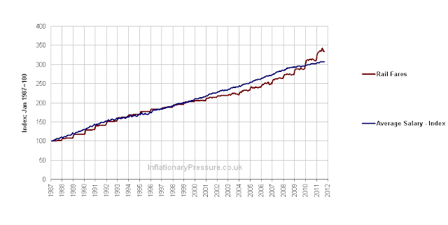
When train fares are compared to average salaries a different trend is discovered, as shown in the chart below.  It now seems that train fares almost perfectly track average wages over the last 25 years.  There was a slight deviation in the increases in the early 2000s, when train fares increased less than RPI, but this was a relatively small amount.
Chart of the indexed cost of train thickets and average UK salaries since 1987 to 2011 showing that the has increased in line with each other
Chart of Historical Train Fares against UK Average Salary Growth Since 1987

This leads to the next question: how have bus and coach fares increased compared to rail fares?  The graph below shows that rail fares and bus & coach fares are very closely correlated as then have tracked each other very closely since 1987.  
Chart of the indexed price of bus and coach tickets and train fares since 1987 showing that the has increased in line with each other
Graph of Historical UK Train Fares against Bus and Coach Fares Since 1987


This leads to the conclusion that wages make up the largest part of the cost-base for trail, bus & coach fares as they have all increased faster than inflation, but in-line with average salaries for a quarter of a century.  So to get train, bus or coach fares to be cheaper in the future, the companies need to 1) be more efficient or automated (ie reducing the head count) or 2) the wages of their staff need to decrease relative to the national average, or a combination of the two.  Not a very pleasant prospect for the employees in the rail, bus and coach industries, if everyone says that fares are too expensive and must come down in the future.

So train, bus and coach fares are just as cheap (or expensive) relatively to wages as they were 25 years.  This will be a controversial result to many.


Tuesday, 13 December 2011

Inflation Adjusted Historical Lithium Price since 1952 - in Pounds Sterling and US Dollars

 Lithium Price still cheaper then in the 1980s and 1990s - Just

Lithium and its compounds have several industrial applications, including heat-resistant glass and ceramics, high strength-to-weight alloys used in aircraft, lithium batteries and lithium-ion batteries.  The end-use markets for Lithium and its compounds are estimated to be: ceramics and glass, 31%; batteries, 23%; lubricating greases, 9%; air treatment, 6%; primary aluminium production, 6%; continuous casting, 4%; rubber and thermoplastics, 4%; pharmaceuticals, 2%; and other uses, 15% (Ref: US Geological Survey, Mineral Commodity Summaries 2011).  With the ever increasing use and demand for high performance lithium and lithium-ion batteries, in a range of applications from laptops and mobile phones to electric cars, this is a very important element to examine. 

The estimated annual average lithium price data came from the US Geological Survey.  The US Geological Survey used lithium carbonate as a proxy to estimate the price for lithium, as lithium carbonate is a good estimator of its price due to the large quantity and importance of this compound compared to other lithium compounds.  

The historical UK Pound to US Dollar exchange rate data came from Lawrence H. Officer, "Dollar-Pound Exchange Rate From 1791," MeasuringWorth, 2011 at www.measuringworth.com The prices were adjusted for inflation by converting the nominal price into the equivalent in 2010 US Dollars and 2010 GP Pounds Stirling.  The US inflation data came from the historical CPI from the US Department of LaborFor the UK inflation the data came from Dominic Webb (2006) "Inflation: the Value of the Pound 1750-2005" Economic Policy and Statistics Section, Research Paper 06/09, House of Commons Library, UK.  From this you get the following results shown in the graph below.
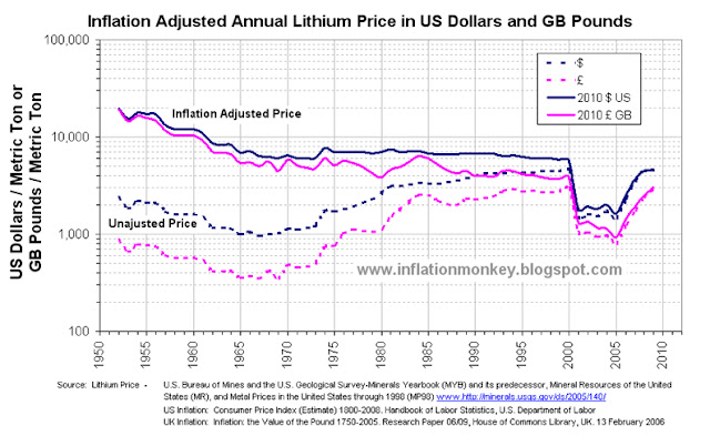
graph showing the historic price of lithium carbonate and the inflation adjusted lithium carbonater price since 1950 to 2011 in Pounds Sterling and Dollars
Historical Annual Average and Inflation Adjusted Lithium Carbonate Price since 1952 in US Dollars and UK Pounds


The doted lines are the unadjusted nominal annual average lithium carbonate price, and the sold lines are the inflation adjusted lithium carbonate price.  The first thing that becomes obvious is that the unadjusted lithium carbonate piece bottomed in the mid to late 1960s, in both UK Pounds and US Dollars at around £350 and $970 per metric ton respectively. 

However when you examine the inflation adjusted lithium carbonate price you observe that it crashed in 2000 a reached an all-time low in 2005 in both GB Pounds and US Dollars at around £930 and $1,30 per metric ton respectively.   Since them the price has risen by 2009 to approximately £3,000 and $4,600 per metric ton respectively.  This trend can be observed more easily in the chart below, which shows only the inflation adjusted lithium carbonate price.
Graph showing the inflation adjusted price of lithium carbonate since 1950 and clearly shows that it is almost as cheap as it has ever been.
Inflation Adjusted Lithium Carbonate Price since 1952 in US Dollars and Pounds Sterling


The second thing that you observe is that the US Dollar price of lithium carbonate was approximately constant from 1975 till the mid 1980s.  Using the stability in the price as a baseline the inflation adjusted lithium carbonate price in UK Pounds and US Dollars were indexed from price in 1975 and this is shown below.
Graph showing the inflation adjusted price of lithium carbonate indexed to the price in1975 and it clearly shows that it is almost as cheap as it has ever been since 1950.
Historical Inflation Adjusted Lithium Carbonate Price since 1952 in US Dollars and GB Pounds, Indexed to 1975


It is also interesting to note the compounded rate of change for the inflation adjusted lithium carbonate prices index in US Dollars and GB Pounds, tracked each other pretty closely.  Although there is much greater volatility in the price in UK Pounds due to the exchange rate volatility in the late 1970s and early 1980s.

The indexed price data clearly displays that since the late 1960s the inflation adjusted lithium carbonate prices has been pretty constant until the crash in 2000.  The price only dropped to approximately 25% of the late 1970s and early 1980s price.  Additionally the rapid price rise since 2006 has taken the price to about 65% of that in the late 1970s and early 1980s.  So from a historical perspective the 2009 is significantly off the inflation adjusted prices of the early 1960s and before and the relatively stable price from 1970s till 2000.


Thursday, 8 December 2011

Inflation Adjusted Historic Silver Price - Pounds Sterling and US Dollars

Every day you hear about Gold or the price of Gold mentioned.  Occasionally you see a chart of the historical price or if you are really lucky, the historical inflation adjusted Gold price (almost always in US Dollars).  A couple of months ago I calculated and posted the historical and inflation adjusted Gold price in Pounds Sterling and US Dollars since 1900 (see hereUpdated Inflation Adjusted Gold Price - US Dollars and UK Pounds).  Now I will show the both the historic Silver price and historical inflation adjusted Silver price in US Dollars and GB Pounds.

The annual average Silver price data came from www.kitco.com and it went back to 1792.  The Historical UK Pound to US Dollar exchange rate data came from Lawrence H. Officer, "Dollar-Pound Exchange Rate From 1791," MeasuringWorth, 2011 at www.measuringworth.com/exchangepound/.  

The prices were adjusted for inflation by converting the nominal price into the equivalent in 2010 US Dollars and 2010 GP Pounds Stirling.  The US inflation data came from the historical CPI from the US Department of Labor.  The UK inflation the data came from Dominic Webb (2006) "Inflation: the Value of the Pound 1750-2005" Economic Policy and Statistics Section, Research Paper 06/09, House of Commons Library, UK.  From this you get the following results shown in the graph below. 

Chart showing the historic price of silver and the inflation adjusted silver price since 1792 to 2010 in Pounds Sterling and Dollars
Historical Annual Average and Inflation Adjusted Silver Price Since 1792 in US Dollars and GB Pounds

The doted lines are the unadjusted annual average Silver price, and the sold lines are the inflation adjusted Silver price.  The first thing that becomes obvious is that the unadjusted Silver piece bottomed in the 1930s, in both UK Pounds and US Dollars at £0.07 and $0.25 per troy ounce respectively.  

However when you examine the inflation adjusted Silver price you observe that it has bottom at around the same price (approximately £4 and $4 in 2010 value) at the beginning of the each of the following decades, 1930s, 1940, 1990s and 2000s.  In fact, for much of the 20th century (from the 1920s to mid 1960s and from the early 1990s until the mid 2000s) the inflation adjusted Silver price has been very low compare to the long term historic average, (which was approximately £15 and $17 in 2010 value).  Below is the inflation adjusted Silver price in UK Pounds and US Dollars indexed back to 1800

Graph showing the index inflation adjusted silver price is cheaper than it was from the 1810 till 1890's
Historical Inflation Adjusted Silver Price Since 1792 in US Dollars and GB Pounds, Indexed to 1800

The second thing that you observe is that the average Silver price in 2010 is now above the long term inflation adjusted historical average.  The price that year was comparable to the price from the mid 1890s until the 1920s. 

It is also interesting to note the compounded rate of change for the inflation adjusted Silver prices index in US Dollars and GB Pounds, tracked each other pretty closely for the majority of the 20th Century.  However before then, there was a sustained period of time since the 1820s when inflation adjusted Silver price indexed to 1800 was significantly larger in Dollars than Pounds?

Written by .

Saturday, 29 October 2011

Inflation Adjusted Oil Price since 1986 - UK Pounds

From reading this Septembers Inflation report from the Office of National Statistic today, one of the sectors highlighted as a big culprit for that month’s large increase in inflation, were fuel and energy.  I regularly see the historical oil price and have often wondered what the historic price was in UK Pounds or what it was when adjusted for UK inflation.  So I thought I would investigate.   

Using the West Texas Intermediate (WTI) crude oil spot price since 1986, from US Energy Information Administration, (www.eia.gov/petroleum/data.cfm#prices) and using the daily UK £ to US $ exchange rate from the Board of Governors of the Federal Reserve System (www.federalreserve.gov/releases/h10/Hist/) to convert it into Pounds Sterling per barrel.  The affect of UK inflation was adjusted for by using the Retail Prices Index (RPI) all items, from the UK Office of National Statistics for the UK inflation (www.ons.gov.uk).  The first two chat shows the daily US Dollar to UK Pound exchange rate and the WTI Oil price in US Dollars and UK Pounds.  

Daily West Texas Intermediate crude oil spot price since 1986 in US Dollars and UK pounds
Daily US Dollar to UK Pound Exchange Rate

It can be seen that the oil price has been pretty volatile in recent years, both in US Dollars and Pound Sterling.  Furthermore the US Dollar to UK Pound exchange rate has been fairly volatile since 1986 and varied from 1.4 to 2.2 US $ to a the UK Pound.  When priced in UK Pounds the oil peaked in 2008 at around £68 per barrel and this price was matched again in April 2011.  When the oil priced peaked in Dollars in 2008, it was around $135 per barrel.  This price has not been matched the rally at the beginning of 2011, where it reached around $110 per barrel.  So in the UK oil is very close to the price peak in 2008 and its all down to the falling value of the UK Pound compared to the US Dollar.  Below is the inflation adjusted historical WTI crude oil spot price in Pounds Sterling.
Inflation adjusted historical WTI crude oil spot price in Pounds Sterling since 1986


The dark blue line is the unadjusted daily spot price converted into UK Pound at that day’s exchange rate.  The pink line is the oil price adjusted to account for UK inflation (RPI).  As it can be seen, the present price in Pounds pretty much where it was in mid 2010 and end of 2005.  The end of 2005 was an interesting time in the UK, as it was the second time that the oil refineries where being blockades by lorry drivers (www.guardian.co.uk/uk/2005/sep/13/politics.oil).  The other time was in late 2000 when the same thing happened (news.bbc.co.uk/1/hi/uk/920679.stm).  The interesting thing to note is that on both of those occasions the oil price in Pounds Sterling was above £50 per barrel.  It looks like the last 26 years of cheap oil in Pounds is well and truly over.


Saturday, 1 October 2011

Have UK Mortgages ever been cheaper?

I was reading an interesting news article on www.moneyobserver.com titled “Mortgages have never been cheaper”.  They talked about the fall in mortgage interest rates and how this equates to mortgages never being cheaper.  Although that is correct, as consumer what really maters tome in the monthly mortgages pay (which is a function of the interest rate and the total loan value).  Over the last decade as mortgage interest rates came down, the total loan value increased.  So I though that I would investigate the historic mortgage interest payments against Inflation (UK RPI) and wages. 

Using the data from the Office of National Statistics, available from the guys over at www.InflationaryPressure.com for their charts, we see the following.
Chart presenting the index of the average UK mortgage interest payment since and the retail price index RPI since 1987 to 2011 showing that the most of the time the mortgage interest payment has grown faster than inflation. However by 2009 mortgage interest payments had dropped by over 40 per cent and have increased in line with inflation ever since.
UK Mortgage Interest Payment vs. PRI.  From: www.InflationaryPressure.com


Chart presenting the index of the average UK mortgage interest payment since and the average UK house prices RPI since 1987 to 2011 showing that there is very little correlation between them.
UK Mortgage Interest Payment vs. Average House Prices.  From: www.InflationaryPressure.com


Presently the average mortgages interest payment has fallen below average wages, meaning that they are cheap historically.  However mortgages interest payment has been very volatile over the past 24 years.  Interestingly average wages index is currently around the middle of the extreme highs and lows in the mortgages interest payment index!  Then you compare the mortgages interest payment against RPI you observe that it is now equal to RPI.  Historically you observe that, uncannily the lows in the mortgages interest payment index equal RPI since 1987.

However when we examine the house price index against the average mortgages interest payment index you notice that they are not collated.  This indicates that something else is the driving force for house price growth.  As we are now finding out, house prices are driven prominently by the amount of money available to be lent out as mortgages.